Pandas, hvplot, datashader, and legends

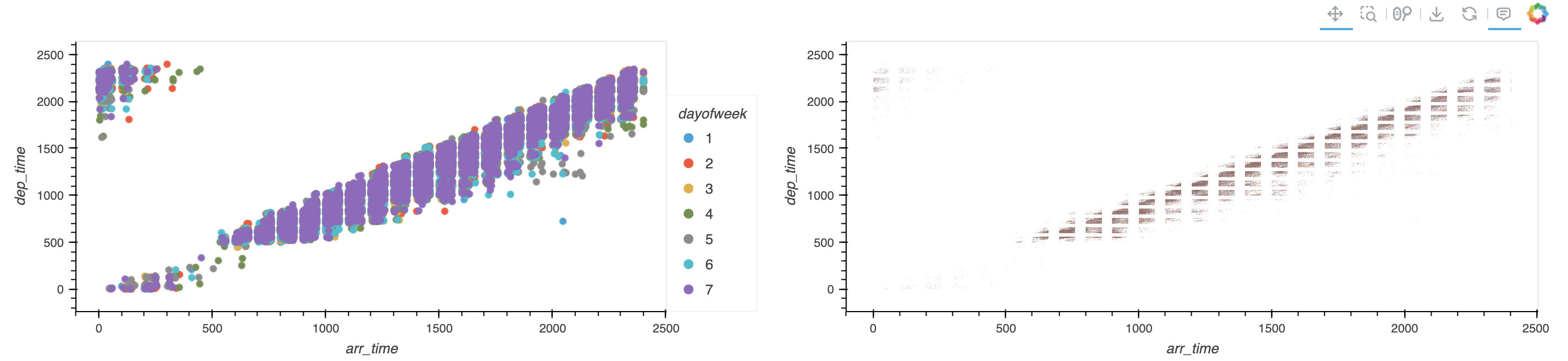
If I produce a scatter plot using df.hvplot.scatter(x='x', y='y', by='color', datashade=True, groupby='group') is there an easy way for me to get it to produce a legend even though the datashader option is on?

Example dataframe:

df = pd.DataFrame([
    {'x': 1, 'y': 2, 'color':'b', 'group':'a'},
    {'x': 2, 'y': 3, 'color':'r', 'group':'b'},
    {'x': 3, 'y': 1, 'color':'r', 'group':'a'},
    {'x': 4, 'y': 0, 'color':'b', 'group':'b'},
    {'x': 5, 'y': 5, 'color':'b', 'group':'a'},
    {'x': 6, 'y': 3, 'color':'r', 'group':'b'},
    {'x': 7, 'y': 2, 'color':'r', 'group':'a'},
])
1 Like

Ran into this today as well. At the very least, it would be great to have a note on Customization ā€” hvPlot 0.7.0 documentation about which options are mutually exclusive or ignored when datashade is set.

1 Like

Once I merge Add automatic categorical legend for datashaded plots by philippjfr Ā· Pull Request #4806 Ā· holoviz/holoviews Ā· GitHub this will become possible. Unfortunately until then the only thing I can suggest is overlaying a set of points.

1 Like

is there any way to preserve the colors when I set rasterize=True? See

Iā€™m still seeing similar problems with datashade=True not showing legends. Any one know if/how to make a legend show up?

As a code example:

# load hvplot and default bokeh extension
import hvplot.pandas
# load some sample data
import hvplot.sample_data

df = hvplot.sample_data.airline_flights.read()

df['dayofweek'] = df.dayofweek.astype('category')

df[df.carrier=='OO'].hvplot.scatter(
    x='arr_time',
    y='dep_time',
    by='dayofweek'
) + df[df.carrier=='OO'].hvplot.scatter(x='arr_time',
                                        y='dep_time',
                                        by='dayofweek',
                                        datashade=True
                                       )

First plot (on left) has a nice legend, second plot (on right) has no legend.

Continuing my previous example, this seems like a messy way to get a legend. Seems like this should be part of the library rather than creating a second plot and overlaying the first.

arr = []
for i in range(1, len(df.dayofweek.unique()) + 1):
    arr.append(df[(df.carrier=='OO') & (df.dayofweek == i)].head(1))
minidf = pd.concat(arr)

minidf.hvplot.scatter(
    x='arr_time',
    y='dep_time',
    by='dayofweek',
    s=1
) * df[df.carrier=='OO'].hvplot.scatter(x='arr_time',
                                        y='dep_time',
                                        groupby='dayofweek',
                                        datashade=True
                                       )

Maybe you can try rasterize=True and set .opts(color_levels=7)

@ahuang11 - Iā€™m not seeing color_levels as an option available at Customization ā€” hvPlot 0.9.0 documentation

I do see that Holoviews does have an option with that name:

import holoviews as hv
hv.help(hv.Raster)

Output includes

color_levels:            Number of discrete colors to use when colormapping or a set of color
                         intervals defining the range of values to map each color to.

However, itā€™s not clear to me how to access that feature from hvplot. Can you provide a code example or link to documentation?

hvPlot is built on top of HoloViews so you can do:
your_rasterized_hvplot_obj.opts(color_levels=7)

And thus should also work
hv.help(your_rasterized_hvplot_obj)

Can you also submit an issue in hvplot to mention that you can use opts too in customization because itā€™s not intuitive for users?

@ahuang11 - Thanks for the additional guidance. Iā€™ll open an issue.

Also, it seems that the color_levels option isnā€™t available for all plotting objects.

by_plot = df[df.carrier=='OO'].hvplot.scatter(x='arr_time',
                                              y='dep_time',
                                              by='dayofweek',
                                              rasterize=True
                                             )
by_plot

Generates this rasterized plot

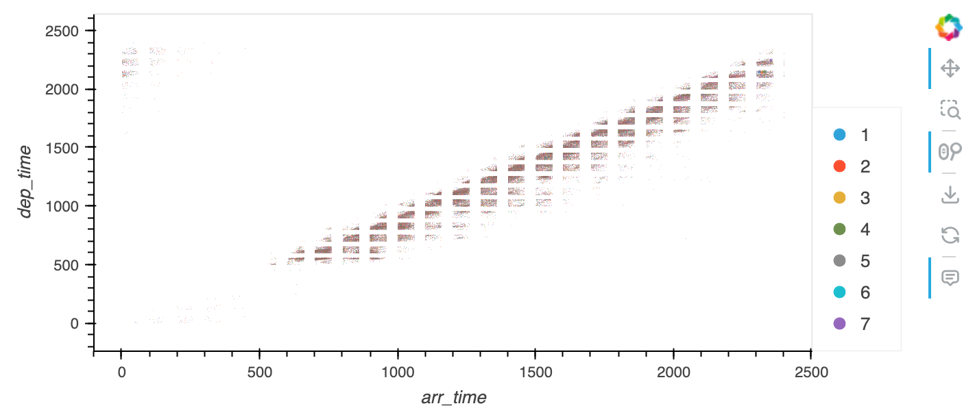
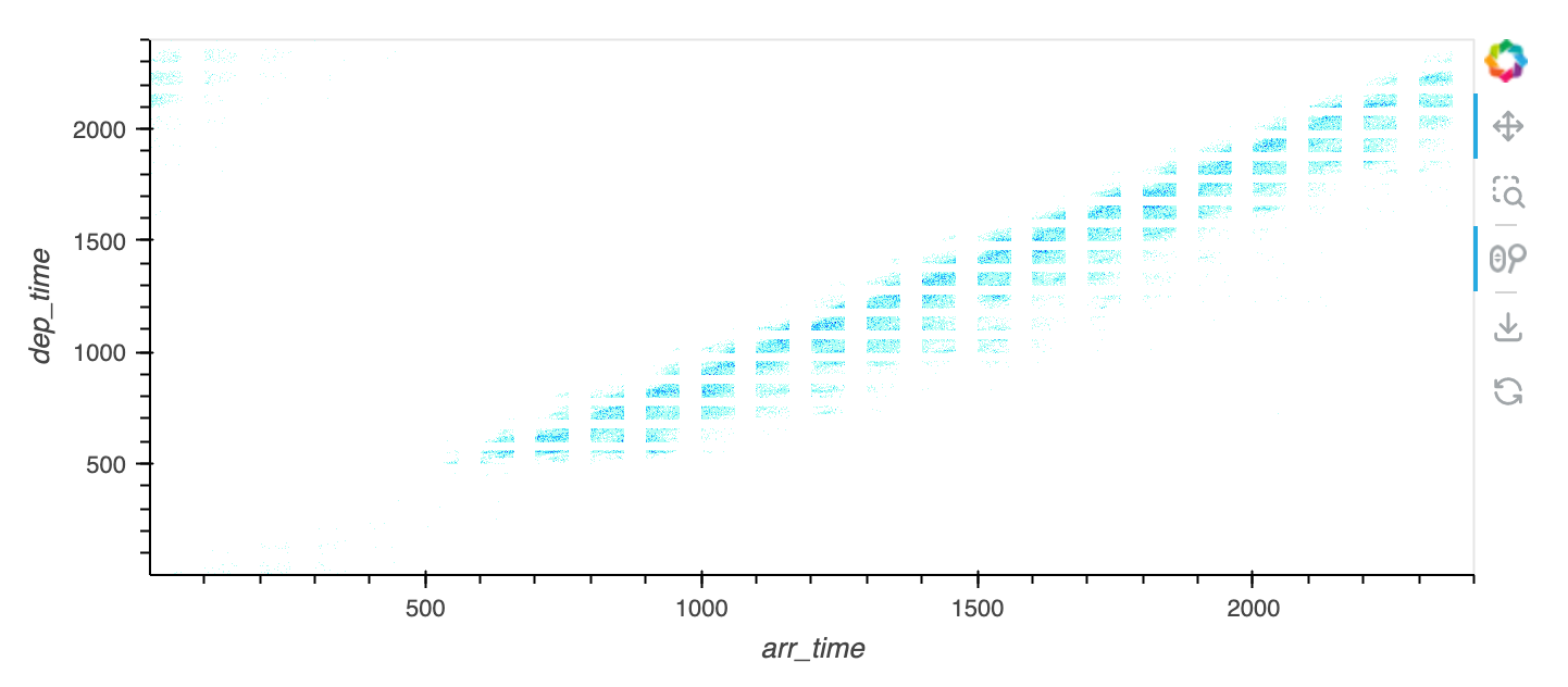
Adding .opts(color_levels=7) to my rasterized plot object results in an error:

by_plot.opts(color_levels=7)

ValueError: Unexpected option ā€˜color_levelsā€™ for NdOverlay type across all extensions. No similar options found.

The Holoviews help doesnā€™t seem to give any indication about color_levels

hv.help(by_plot)

Parameters of ā€˜DynamicMapā€™ instance

Parameters changed from their default values are marked in red.
Soft bound values are marked in cyan.
C/V= Constant/Variable, RO/RW = ReadOnly/ReadWrite, AN=Allow None
ā€¦

(continues on with a lot of items but color_levels is not included)

When printing my plot object this is what it tells me.

print(by_plot)

:DynamicMap
:NdOverlay [dayofweek]
:Image [arr_time,dep_time] (arr_time_dep_time Count)

Iā€™m starting to see that I need to understand Holoviews in order to actually use hvPlot outside the default functionality.

updated: Realized I had an incorrect import that was breaking my hv.help() call!

If I do a groupby plot, the color_levels option is available. However, this is not what I want as itā€™s different than the by plot.

groupby_plot = df[df.carrier=='OO'].hvplot.scatter(x='arr_time',
                                              y='dep_time',
                                              groupby='dayofweek',
                                              rasterize=True,
                                             )
groupby_plot.opts(color_levels=7)

Try: y_plot.opts(ā€œImageā€, color_levels=7)

Closer - at least it doesnā€™t throw an error. However, the resulting plot is unchanged from before the options.

Are you sure thatā€™s rasterize=True? That looks like datashade=True?

Totally possible that this whole issue is just a PEBCAK!

Hereā€™s the whole code in one notebook:

This binder link should work also, though can be slow to start:

@philippjfr - Perhaps my recent comments are just due to lack of understanding of how to use new Holoviews features in hvPlot as mentioned in your Holoviews issue ā€œAdd automatic categorical legend for datashaded plotsā€

It was merged into main/master back in May of 2022.

Do you have any recommendations on how to take advantage of your code in hvPlot?
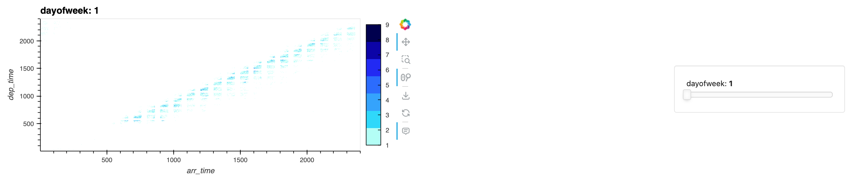
I havenā€™t taken a deep look, but maybe this will help you
https://examples.holoviz.org/census/census.html

Thatā€™s a great example of what can be done with Datashader. However, in my opinion, itā€™s also an example of one of the limitations of Datashader: none of the graphics have a legend. The only way to understand the visualizations is to read the paragraphs of text.

I think, in the case of a single color, a carefully worded plot title/description could explain what is being shown. For those with multiple colors, the color_key should be a part of every plot instead of only in text/code:

if background == "black":
      color_key = {'w':'aqua', 'b':'lime',  'a':'red', 'h':'fuchsia', 'o':'yellow' }
else: color_key = {'w':'blue', 'b':'green', 'a':'red', 'h':'orange',  'o':'saddlebrown'}