Scatter plot of xarray Dataset with coords: One point to select

I am relatively new to data analysis in Python so please excuse if the following is just plain stupid. Also my issue seems to be comparable to this issue.

When I create a scatter plot of an xarray Dataset with dimension but no defined coordinate values, the scatter plot is as expected. However, when I add coordinate values to the Dataset, the scatter plot shows just one point with the option to select the point by its coordinates. Obviously, this is not what I want with a scatter plot.

Here the example:

import hvplot.xarray
import numpy as np
import xarray as xr

ta = xr.DataArray(np.random.random((2, 3, 4)), dims=("time", "lat", "lon"))
tsurf = xr.DataArray(np.random.random((2, 3, 4)), dims=("time", "lat", "lon"))

ds = xr.Dataset({"ta": ta, "tsurf": tsurf})

ds.plot.scatter(x="tsurf", y="ta")
ds.hvplot.scatter(x="tsurf", y="ta")

ta = ta.assign_coords({"time": [0, 12], "lat": [0, 1, 2], "lon": [0, 1, 2, 3]})
ds = xr.Dataset({"ta": ta, "tsurf": tsurf})

ds.hvplot.scatter(x="tsurf", y="ta")

While the first hvplot.scatter does what I want, I get the following with the second:

Is this a bug or a feature? If a bug, is it a bug of hvplot or holoviz so that I create the bug report in the right repository? Or is it me being stupid? :wink:

The sliders are by design, as they allow you to explore multi-dimensional datasets.

If you want all points at once, you can either apply dimensionality reduction, such as .mean()/.sum()/.median()/etc on your dataset, or you can pass the dimension names to the by argument in the plot call, drop the legend, and then set the color to be the same:

ds.hvplot.scatter(x="tsurf",y="ta",by=['time','lat','lon'],legend=False,c='blue')

With legend on:

ds.hvplot.scatter(x="tsurf",y="ta",by=['time','lat','lon'],responsive=True).opts(min_height=600,legend_position='bottom',legend_cols=10)

1 Like

Thank you very much. This works, however, it is very slow; too slow actually for my data. To show that, I simplified my example a bit

import hvplot.xarray
import numpy as np
import xarray as xr

n = 1000
ta = xr.DataArray(
    np.random.random(n),
    dims=("x"),
    coords={"x": np.arange(0, n)},
)
tsurf = xr.DataArray(
    np.random.random(n),
    dims=("x"),
    coords={"x": np.arange(0, n)},
)
ds = xr.Dataset({"ta": ta, "tsurf": tsurf})

ds.hvplot.scatter(x="tsurf", y="ta", by=["x"], legend=False, c="blue")

On my system (quiet new AMD Ryzen 7 PRO 6850U with enough free RAM), for n=1000, the plotting command takes about 30 seconds. That’s really long, isn’t it? For n=100, it’s about 1 second. My real data set as about 1000×1000 points so this approach is unusable in this case.

I suppose some more stuff is going on in hvplot. Can you reproduce the issue? Is this worth a bug report?

It’s because you’re trying to plot multi-dimensional datasets. All coordinates are materialized.

If you want faster plotting, you’ll need to drop some dimensions by applying reductions, such as .mean()/.sum()/etc…

Thanks for the reply but, unfortunately, I don’t understand it. The second example produces a scatter plot of two variables, both just being 1d. I just want to create a scatter plot of 1000 points. There are no means or sums to be calculated.

Maybe I am mistaken, but a simple scatter plot with 1000 points should be possible. The input data in the example is as simple as it can be. The respective xarray/matplotlib plot appears kind of immediately:

ds.plot.scatter(x="tsurf", y="ta")
import hvplot.xarray
import numpy as np
import xarray as xr

n = 1000
ta = xr.DataArray(
    np.random.random(n),
    dims=("x"),
    coords={"x": np.arange(0, n)},
)
tsurf = xr.DataArray(
    np.random.random(n),
    dims=("x"),
    coords={"x": np.arange(0, n)},
)
ds = xr.Dataset({"ta": ta, "tsurf": tsurf})
ds.swap_dims({"x": "tsurf"}).hvplot.scatter(x="tsurf", y="ta", legend=False, c="blue")

If you simply want to plot tsurf against ta, maybe you can just remove “x” from the equation by swapping dims

2 Likes

Thanks, that works indeed and is also very fast. Even both legend=False and c="blue" are not necessary.

My data, though, has more dimensions and I guess this trick does not work then. Of course I could flatten the data before or converting it to a pandas object but then I would loose some of the advantages of xarray. On the other hand, it shows that a quick scatter plot is possible. I will try more things and will open a feature request later.

I am not sure what your goal is, but you can temporarily convert it to dataframe

import hvplot.pandas
import numpy as np
import xarray as xr

ta = xr.DataArray(np.random.random((2, 3, 4)), dims=("time", "lat", "lon"))
tsurf = xr.DataArray(np.random.random((2, 3, 4)), dims=("time", "lat", "lon"))

ds = xr.Dataset({"ta": ta, "tsurf": tsurf})

ds.plot.scatter(x="tsurf", y="ta")
ds.hvplot.scatter(x="tsurf", y="ta")

ta = ta.assign_coords({"time": [0, 12], "lat": [0, 1, 2], "lon": [0, 1, 2, 3]})
ds = xr.Dataset({"ta": ta, "tsurf": tsurf})
ds.to_dataframe().hvplot.scatter("ta", "tsurf")

Thanks. That’s exactly what I had in mind with the conversion to a pandas object. It seems hvplot somehow behaves better with pandas objects.
The reason why I wanted to avoid this step is that in reality I have a data set with data arrays with different numbers of dimensions. Something like:

<xarray.Dataset>
Dimensions:          (time: 23, x: 1024, y: 1024)
Coordinates:
  * time             (time) timedelta64[ns] 01:00:00.101999999 ... 1 days 00:...
  * x                (x) float64 1.0 3.0 5.0 ... 2.043e+03 2.045e+03 2.047e+03
  * y                (y) float64 1.0 3.0 5.0 ... 2.043e+03 2.045e+03 2.047e+03
Data variables:
    ta               (time, y, x) float32 ...
    tsurf            (time, y, x) float32 ...
    building_type    (y, x) float64 ...
    vegetation_type  (y, x) float64 ...
    pavement_type    (y, x) float64 ...
    water_type       (y, x) float64 ...

Because within a data frame all columns have the same length, all arrays with dimensions (y, x) would be repeated 23 times to fill up the time dimension of ta and tsurf.

Maybe it’s me being a victim of the second-system effect coming from the R ecosystem. I am currently trying to understand what is possible with python and what is the most efficient workflow for me. So I was happy to find xarray, which resembles my data very well. I tried to avoid format conversions because this might increase memory demand which could be an issue.

Thanks for sharing; if you can provide a similar MRVE with sample data and explain what you’d like to visualize, I’d be happy to help find a better solution!

1 Like

Thank you very much for your kind offer!
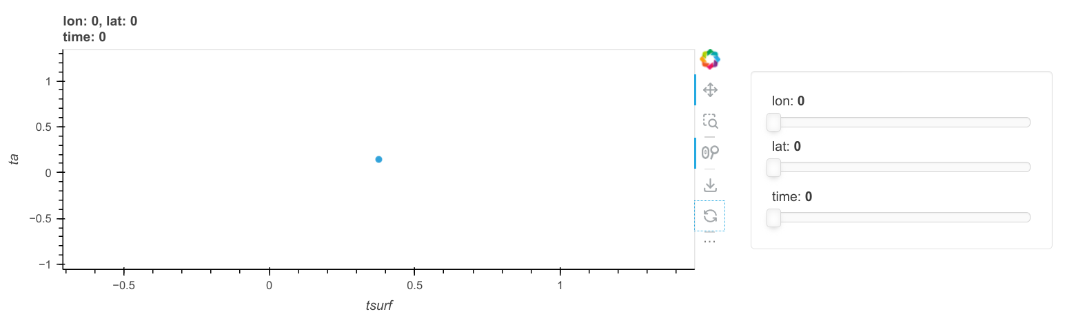
The following is a more complete example of how my data looks:

import hvplot.pandas
import numpy as np
import pandas as pd
import xarray as xr

# data
ta = xr.DataArray(
    np.random.random((4, 2, 3)),
    dims=("time", "lat", "lon"),
    coords={"time": np.arange(0, 4), "lat": np.arange(0, 2), "lon": np.arange(0, 3)},
)
tsurf = xr.DataArray(np.random.random((4, 2, 3)), dims=("time", "lat", "lon"))
ptype = xr.DataArray(
    np.array([3, 2, np.nan, 1, np.nan, np.nan]).reshape((2, 3)), dims=("lat", "lon")
)
vtype = xr.DataArray(
    np.array([np.nan, np.nan, 5, np.nan, 2, 7]).reshape((2, 3)), dims=("lat", "lon")
)

ds = xr.Dataset({"ta": ta, "tsurf": tsurf, "ptype": ptype, "vtype": vtype})

resulting in a Dataset

<xarray.Dataset>
Dimensions:  (time: 4, lat: 2, lon: 3)
Coordinates:
  * time     (time) int64 0 1 2 3
  * lat      (lat) int64 0 1
  * lon      (lon) int64 0 1 2
Data variables:
    ta       (time, lat, lon) float64 0.7546 0.5793 0.1435 ... 0.5606 0.545
    tsurf    (time, lat, lon) float64 0.164 0.9778 0.8544 ... 0.4033 0.3633
    ptype    (lat, lon) float64 3.0 2.0 nan 1.0 nan nan
    vtype    (lat, lon) float64 nan nan 5.0 nan 2.0 7.0

The idea is that I have “maps” (lat and lon) of air temperatures ta above certain surfaces with temperatures tsurf for different times. For each surface (lat and lon), I know its pavement type (ptype) and vegetation type (vtype). Both, ptype and vtype, do not overlap, i.e. if one is not nan, the other must be nan. In my real data, all dimensions are (potentially much) larger and I also have more type-like arrays, i.e. more arrays that are independent of time.

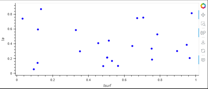
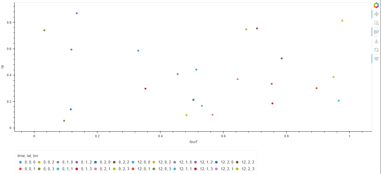
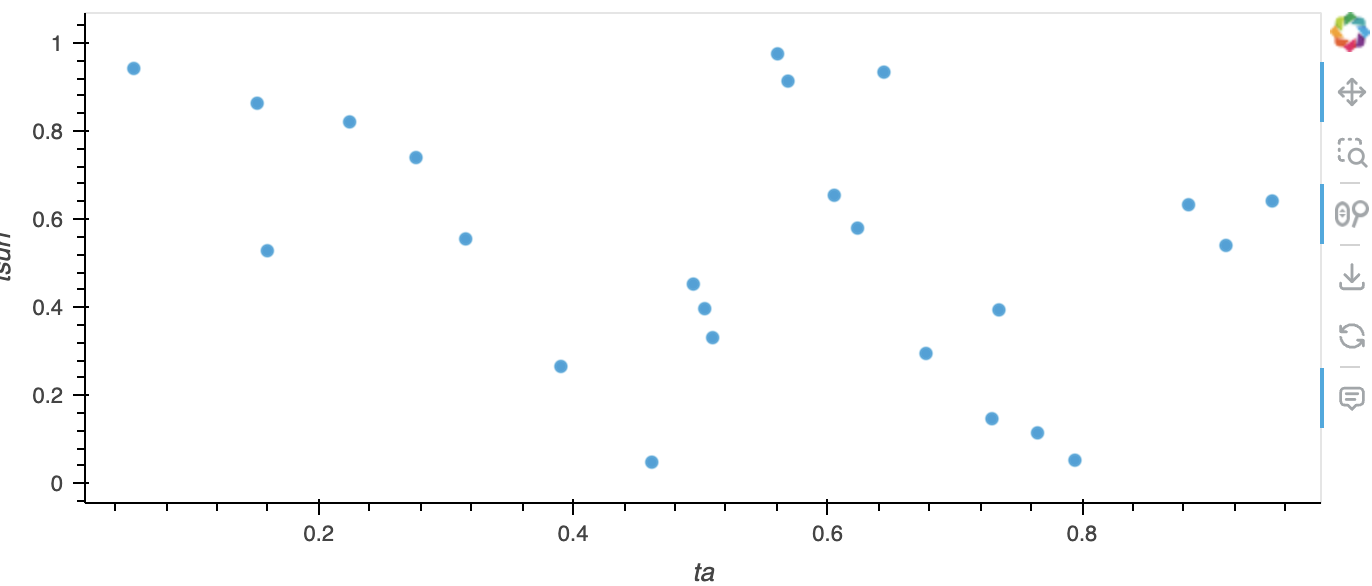
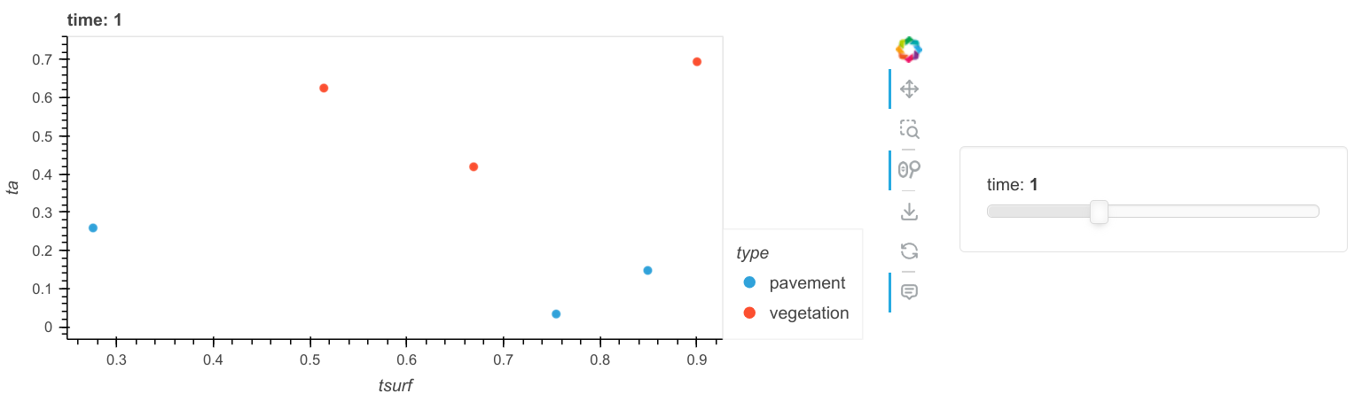
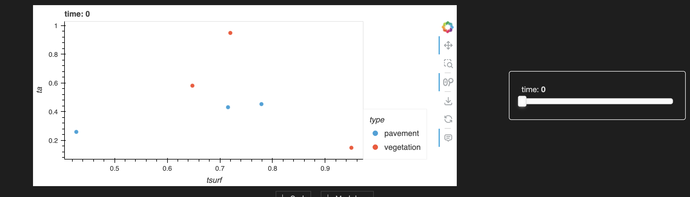
My aim is now to create a scatterplot of ta vs tsurf, by type and each time. I do have a solution for that but it is based on a pandas dataframe:

df = ds.to_dataframe()

# generalization of types
df["type"] = df["ptype"].notna() * 1 + df["vtype"].notna() * 2
df["type"] = (
    df["type"].astype("category").cat.rename_categories(["pavement", "vegetation"])
)

df.hvplot.scatter(x="tsurf", y="ta", by="type", groupby="time")

resulting in

The advantage of pandas is that I can use a categorical dtype for type which is not available in xarray (please correct me if I am wrong here). The disadvantage is, however, that in order to fill the table, all non-time dependent quantities are replicated resulting in a unnecessarily large dataset:

                    ta     tsurf  ptype  vtype        type
time lat lon                                              
0    0   0    0.754638  0.163989    3.0    NaN    pavement
         1    0.579287  0.977793    2.0    NaN    pavement
         2    0.143468  0.854425    NaN    5.0  vegetation
     1   0    0.001652  0.898264    1.0    NaN    pavement
         1    0.746001  0.787206    NaN    2.0  vegetation
         2    0.305514  0.316464    NaN    7.0  vegetation
1    0   0    0.327031  0.647004    3.0    NaN    pavement
         1    0.458336  0.968298    2.0    NaN    pavement
         2    0.892447  0.711597    NaN    5.0  vegetation
     1   0    0.839581  0.674225    1.0    NaN    pavement
         1    0.914335  0.250300    NaN    2.0  vegetation
         2    0.592095  0.444696    NaN    7.0  vegetation
2    0   0    0.993893  0.067323    3.0    NaN    pavement
         1    0.551221  0.554406    2.0    NaN    pavement
         2    0.645342  0.683610    NaN    5.0  vegetation
     1   0    0.973098  0.933462    1.0    NaN    pavement
         1    0.704639  0.053339    NaN    2.0  vegetation
         2    0.976332  0.161400    NaN    7.0  vegetation
3    0   0    0.530574  0.550358    3.0    NaN    pavement
         1    0.139996  0.707700    2.0    NaN    pavement
         2    0.964032  0.175724    NaN    5.0  vegetation
     1   0    0.225253  0.981884    1.0    NaN    pavement
         1    0.560618  0.403304    NaN    2.0  vegetation
         2    0.544982  0.363305    NaN    7.0  vegetation

Thus, my idea was to stick with the xarray object. Any idea how to do that? Or any other advice?

Does this work?

import hvplot.xarray
import numpy as np
import pandas as pd
import xarray as xr

# data
ta = xr.DataArray(
    np.random.random((4, 2, 3)),
    dims=("time", "lat", "lon"),
    coords={"time": np.arange(0, 4), "lat": np.arange(0, 2), "lon": np.arange(0, 3)},
)
tsurf = xr.DataArray(np.random.random((4, 2, 3)), dims=("time", "lat", "lon"))
ptype = xr.DataArray(
    np.array([3, 2, np.nan, 1, np.nan, np.nan]).reshape((2, 3)), dims=("lat", "lon")
)
vtype = xr.DataArray(
    np.array([np.nan, np.nan, 5, np.nan, 2, 7]).reshape((2, 3)), dims=("lat", "lon")
)

ds = xr.Dataset({"ta": ta, "tsurf": tsurf, "ptype": ptype, "vtype": vtype})
ds["type"] = xr.zeros_like(ds["ptype"])
ds["type"] = xr.where(ds["ptype"].notnull(), "pavement", "vegetation")
ds.hvplot.scatter(x="tsurf", y="ta", by="type", groupby="time")

1 Like

This works! Thanks a lot!
At first, I was afraid that this would trigger the issues I had above for a larger number of data points. However, it works well and fast. The reason is the groupby. If I would not want the separation by time, ds.hvplot.scatter(x="tsurf", y="ta", by="type") again produces just one point. ds.hvplot.scatter(x="tsurf", y="ta", by=['time','lat','lon']) is again too slow for a larger number of points.

This is actually funny because a more complex plot (scatter plot with slide for one dimension) works much better than a simple plot (scatter plot for all data points). I guess this behaviour justifies a bug report / feature request.

1 Like

github issue

Explicitly setting groupby=[] seems to do the trick.

3 Likes

Great, thanks. This could be a good default behaviour.

Is there a bug to record somewhere?

I don’t think it’s a bug.

2 Likes

Neat, I wasn’t aware of groupby=[] showing all dimensions!

When I was creating the linked Github issue, my understanding (and I think also of this thread) was that the only way to get a “normal” scatter plot for my data was

ds.hvplot.scatter(x="tsurf",y="ta",by=['time','lat','lon'],legend=False,c='blue')

which was very slow. So slow that I thought this must be an issue.

Now, with groupby=[], it’s perfectly fine. Now, I just find the behaviour slightly strange: inconsistent, because it depends on whether dimensions have coordinate values or not, and to be just a strange default (one point scatter plot).

Anyway, thanks again for all the help!