Sorry if this is a noob question but I could not find an example in the tutorials/docs.
I am considering moving from plotly to holoviews and I am wondering how to create a graph with the following properties:
there should be an arbitrary number of separate time series which should be shown “stacked” vertically one above the other
they all share the same x-axis (time), so the x-axis should only be shown once
they all have different y-axes
the time series is very long, so it should be possible to only show a smaller period and scroll horizontally in which case all time series should get scrolled simultaneously
ideally it should be possible to show additional scatterplot/lineplot data underneath the x-axis to show data that describes specific aspects of the time series at the corresponding time
With pure plotly the whole series gets loaded into JS and the range slider (shown below) can be used to zoom and scroll horizontally, alternately one can use plotly-resample to only show a subsample of up to e.g. 5000 datapoints in the Graph, and every time the plot gets zoomed/scrolled, the resampler creates a new sample for showing it.
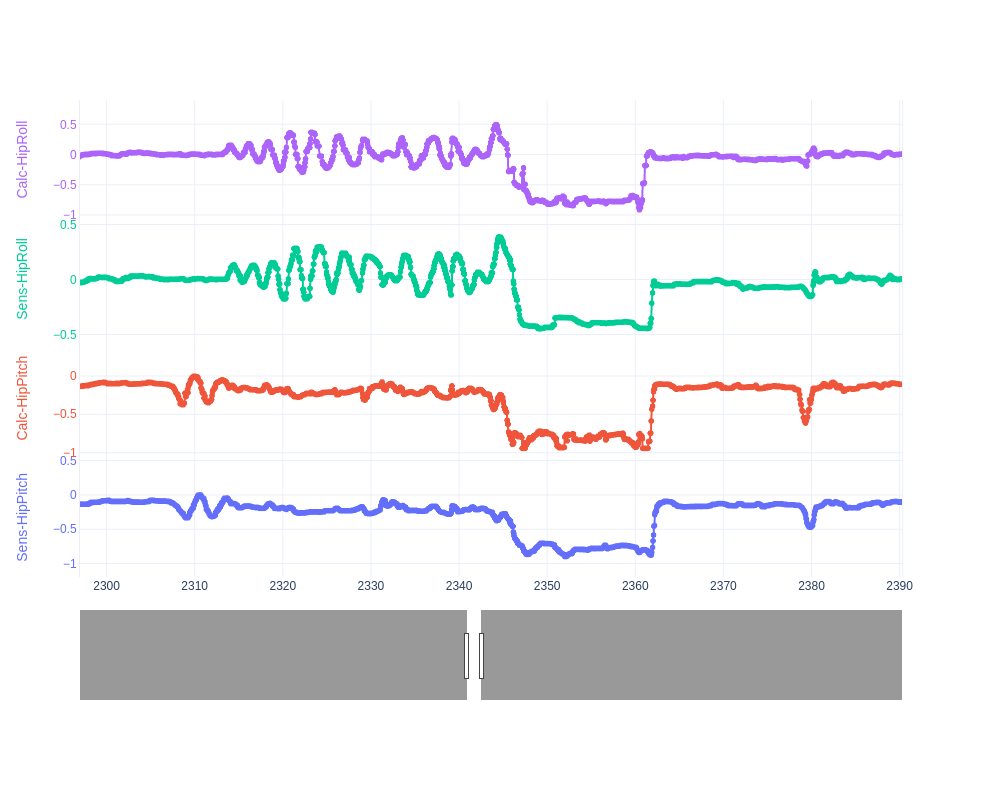
Here is a screenshot of what this looks like in plotly:
I am not an expert in this question, but the starting point for me would be to search the Holoviews documentation for words like container, facet or grid.
After doing that I think this is the relevant guide to check out Dimensioned Containers.
For the range tool you are probably after the RangeToolLink described in Timeseries Range Tool ?
How to combine that, I don’t know. @jstevens do you have a better reference?
When I look at the example plots on that page I cannot see a plot where we have stacked curves which share the x-axis but have separate, individually labeled and scaled y-axes.
It is unclear to me how one would go about telling holoviews how to do this - in plotly, there is an api which allows to specify any non-standard settings for each of up to 9 axes, if necessary: where to place it on the graph, how to label it, how to specify the range, how to format etc. And separating them vertically is done by something called the “domain” in the plot, where each axis is assigned a fraction of the toal vertical space.
So the example I shared is really just a single graph, with overlaid traces, each trace having its own vertical band and axis, not a combination of several graphs into one figure. The rangeselector then is applied to the x-axis of that single graph.
Not sure if something similar to this is possible in holoviews? In the page you shared it looks more like these are all examples where several linked graphs are shown, each with there own x and y axis (though they are suppressed in e.g. the GridSpace and replaced with axes that indicate the grid parameters)