When I saw the .interactive documenation I had two thoughts. 1) This can be really, really powerful 2) Oh no. Why is the documentation based on xarray. Most people don’t know that (I claim) and would like to use Pandas.
I’ve spend quite sometime without being able to do it. But I think you should take a look at the dataframe in your example because all the data is in the index and the time values are Timestamps to Pandas, so I would not expect an intslider to work. Furthermore the .isel method is not a method on a pandas dataframe so you would need to find a similar method.
I got stuck here. No error message and nothing displayed.
import pandas as pd
import xarray as xr
import hvplot.pandas
import panel as pn
import panel.widgets as pnw
pn.extension()

ds = xr.tutorial.load_dataset('air_temperature')
df = ds.to_dataframe().reset_index().set_index("time")
dfi=df.interactive()
table=dfi[df.index==pn.widgets.DateSlider]
app = pn.Column(table)
app.servable()
Worth noting that the pandas integration works in general but has trouble keeping track of boolean mask indexing (like autompgi[autompgi['yr'] == year]), so if you switch it out for a regular method call like .query it works okay:
from bokeh.sampledata.autompg import autompg

w = pn.widgets.TextInput(name='Query', value='yr == 70')

autompg.interactive().query(w).groupby('origin').mean().hvplot('origin', 'mpg', kind='bar')
or an interact from ipywidgets or panel (but then you have to define a function just for that which is annoying).
The mental model of this API is way clearer, more expressive and easier too learn (I guess). It helps to reduce the cognitive load.
Question: as a newbie, is the investment worth, moving from using a tools that works already (with #holoviews and #panel), and what would be the advantage?
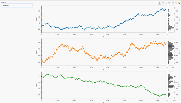
For example, as a follow-up to my HoloViews question I built this complete Panel app:
## Preliminaries ##
import pandas as pd
import numpy as np
import panel as pn
import holoviews as hv
from holoviews.util.transform import dim
from holoviews.selection import link_selections
from holoviews import opts
from ipywidgets import interactive, interact, Select
import hvplot.pandas
hv.extension('bokeh', width=100)

## Data generation ##
data_df1= pd.DataFrame()
npoints=15000
np.random.seed(71)
x = np.arange(npoints)
y1 = 1300+2.5*np.random.randn(npoints).cumsum()
y2 = 1500+2*np.random.randn(npoints).cumsum()
y3 = 3+np.random.randn(npoints).cumsum()
data_df1.loc[:,'x'] = x
data_df1.loc[:,'rand1'] = y1
data_df1.loc[:,'rand2'] = y2
data_df1.loc[:,'rand3'] = y3
data_df1.loc[:,'location'] = 'location1'
data_df2= pd.DataFrame()
np.random.seed(81)
y1 = 1300+2.5*np.random.randn(npoints).cumsum()
y2 = 1500+2*np.random.randn(npoints).cumsum()
y3 = 3+np.random.randn(npoints).cumsum()
data_df2.loc[:,'x'] = x
data_df2.loc[:,'rand1'] = y1
data_df2.loc[:,'rand2'] = y2
data_df2.loc[:,'rand3'] = y3
data_df2.loc[:,'location'] = 'location2'
data_df = pd.concat([data_df1, data_df2])

## App preliminaries ##
pn.extension()
hv.opts.defaults( hv.opts.Histogram(fill_color='gray'))

## Location selection widget ##
locations = list(data_df['location'].unique())
loctn=pn.widgets.Select(options = locations, value = locations[0], name = 'location')

## Panel App via reactive function ##
@pn.depends(loctn.param.value)
    def plot_locations(loctn):
        dt = data_df.loc[data_df['location']==loctn]
        colors = hv.Cycle('Category10').values
        series   = ['rand1', 'rand2', 'rand3']
    layout = hv.Layout([hv.Curve(dt, 'x', lc).opts(height=300, width=1200, color=c).hist(lc) for c,
                        lc in zip(colors,[d for d in series])])
    return link_selections(layout).cols(1)
pn.Row(loctn, plot_locations)
Thanks @SandervandenOord
I am curious though if this is just a matter of preference /syntax/what you learned first or if there are important considerations in terms of efficiency or other that would be good to know for someone at the beginning of the journey. I for one was way into holoviews documentation, and having made sn app using Panel and Matplotlib before I even heard of hvplot. Would you give some specifics?
For me it’s not that hvPlot is better or worse than some other approach, but that to get anything done in practice, people first start learning a data library API, not a plotting library API. We can’t assume that everyone will go all in and fully learn our own new API, whether it is a good one or not. Instead, let’s try to fit in viz to the API they already need to learn, letting people keep using what they are doing in nearly every way and just do a tiny switch to make plots (.hvplot) or to add widgets (.interactive).
Just wondering what are good usecases for .interactive() versus good usecases for using the argument groupby inside an hvplot call. Would love hearing your thoughts on this
Personally, I’d say that .interactive() is useful if you have an existing already debugged pipeline that leads to a single plot, and you then want to parameterize it with a widget; .interactive() lets you do so without changing any of your logic. I.e., if you explicitly think, “I need a widget for this parameter right here, instead of hard coding it to 1998”, then .interactive() lets you do that. Whereas the groupby call makes you think in a different way about the task involved, even though the final result is the same. .interactive() also makes it more obvious how to control the specific type and configuration of widget that you get in this case, whereas for a groupby the widget is implicit. Use whichever approach maps better onto what you are trying to do and how you are thinking about it!